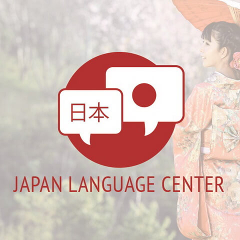
The brief for this design specified professionalism married with approachability for a Japanese language tutoring and translation center. Approachability was achieved by combining the shape of a dialogue balloon with the Japanese flag, while a professional look was maintained by using clean lines and a clear, understated typeface.
The logo can be found on the company’s website.


